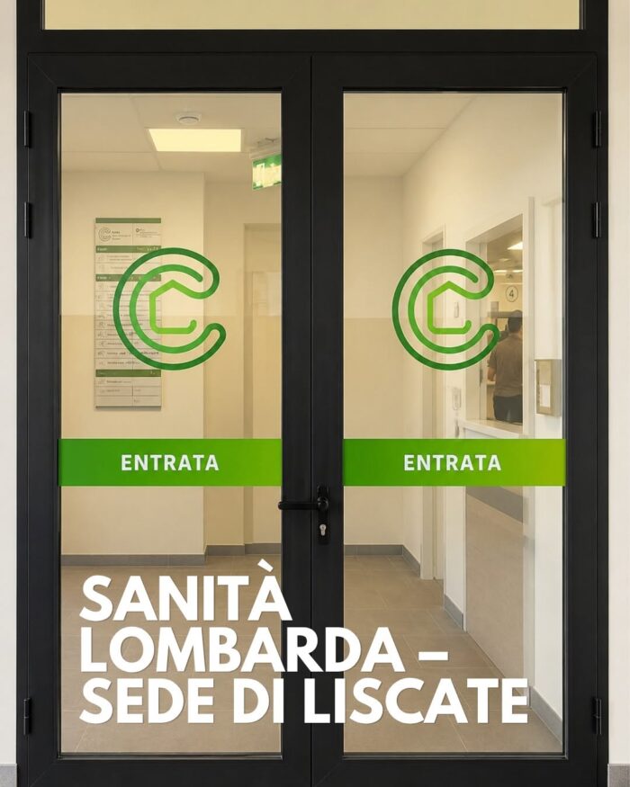
Community Health Centre, Liscate, Milan

Community Health Centers are the new focal point for local healthcare in Lombardy.
Outpatient clinics, blood sampling, vaccinations, social services, and booking counters—all consolidated in a single building.
For the Liscate facility, we implemented a comprehensive system:
– exterior signage and entrance identification
– floor directories organized by level and service
– ceiling-mounted directional panels featuring custom pictograms
– counter numbering and institutional window graphics
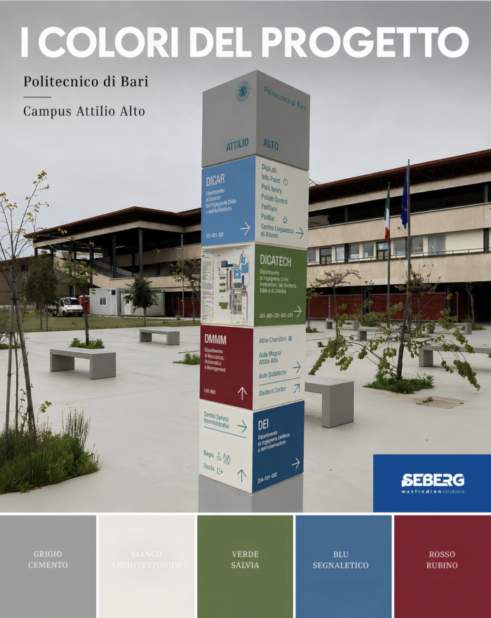
The colors of the project

On a campus as large as the Polytechnic University of Bari, with dozens of buildings, departments, and services spread across vast areas, wayfinding can’t rely solely on text. A visual language is needed that’s immediately recognizable even from a distance. Color becomes that tool.

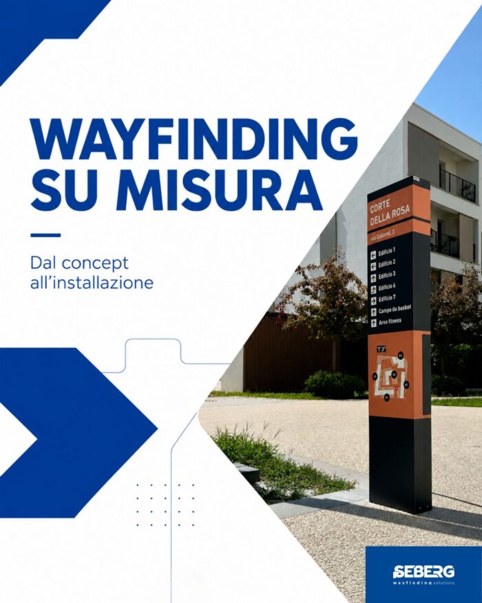
Tailor-made wayfinding

Do you need a custom wayfinding system?

Since 1988 we have been supporting architectural firms, general contractors and clients in the design, production and installation of customized wayfinding systems, in Italy and abroad.

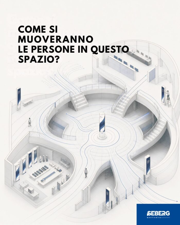
How will people move in this space?

Prototyped. Materials, proportions, and readability are validated before going into production.

Production — We manufacture in-house, with direct control over quality, lead times, and technical specifications. Each component meets the design criteria defined upstream.

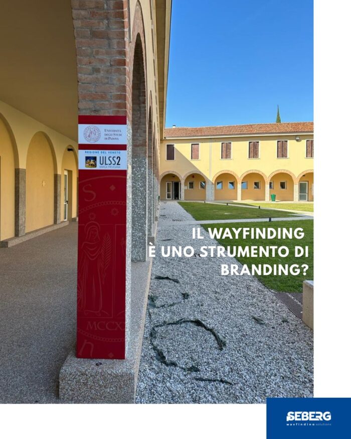
Wayfinding as a branding tool

A company’s brand doesn’t just exist in its logo. It lives in the spaces where people work every day.

Colors, materials, typography, coherence from one floor to the next: every element communicates something—to those who work there, to those who visit, to those who enter for the first time.

A custom-designed wayfinding system transforms hallways, reception areas, and common areas into an extension of your corporate identity.

Did you know that…

Wayfinding in a Nutshell – The 3-Second Rule

In high-traffic environments, a sign has about 3 seconds to communicate the correct direction.

This isn’t a randomly estimated time: it’s the margin within which the user decides whether to proceed or hesitate. Beyond that threshold, the system has already failed.

For this reason, the design focuses on typographic hierarchy, color contrast, and information load reduction—every additional element is a potential slowdown.

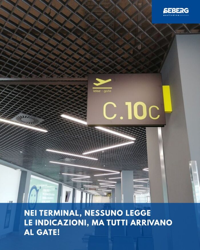
Terminal signage

In the terminal, no one reads the signs. Yet everyone arrives at the gate.

You’re running to the gate. Your flight is in twenty minutes, the terminal is huge, and you don’t speak the language. You look up and read the signs. You reach the gate.

Visual hierarchy, color contrast, placement at decision points: every element is where it needs to be, before you even need it.

The best wayfinding is the one you don’t notice. But if it were missing, you would immediately notice it.

We develop customized solutions for national and international projects.
If you are developing a complex project, let’s talk about it