
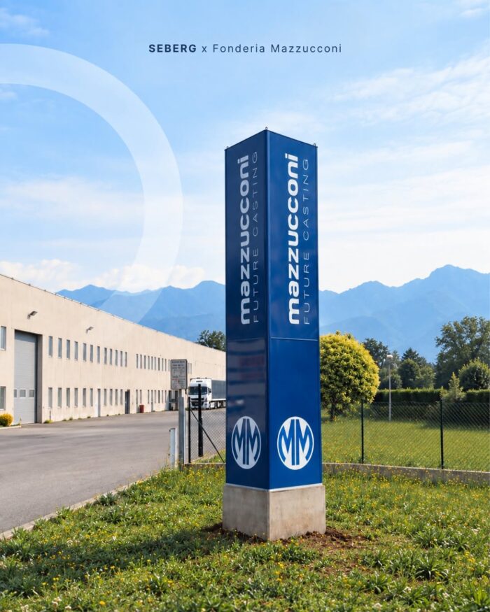
Fonderia Mazzucconi
The entrance to a major industrial enterprise deserves a welcome worthy of its history.
For Fonderia Mazzucconi SpA, an industrial leader in the Bergamo area, we created this three-sided totem standing over 5 meters tall.

The entrance to a major industrial enterprise deserves a welcome worthy of its history.
For Fonderia Mazzucconi SpA, an industrial leader in the Bergamo area, we created this three-sided totem standing over 5 meters tall.

Every material has its natural habitat.
A wayfinding project must coexist harmoniously with its environment, while preserving the original vision of the architectural design.
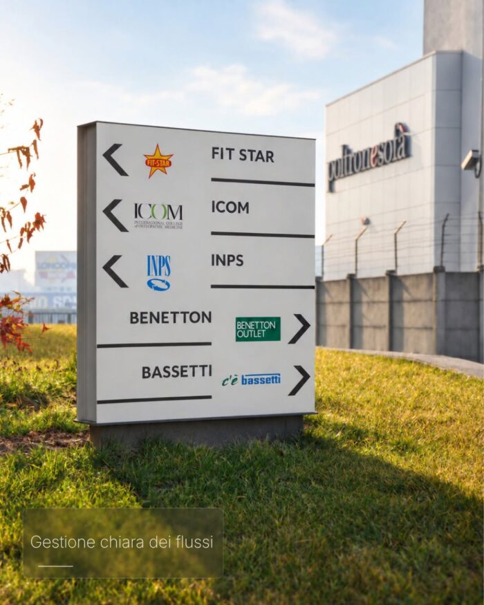
Outdoor signage – A facility’s first real “welcome”
Whether at a hospital, a campus, or a commercial district, outdoor signage serves as the very first point of contact with people. It is not merely a matter of placing signs, but of guiding arrivals by creating a seamless, logical, and stress-free path.

Forms, materials, and solutions capable of integrating into the space and facilitating immediate wayfinding lie at the heart of truly effective interior signage.
Indeed, within indoor spaces, every sign stems from distinct requirements:
the viewing distance, the architectural context, the frequency of information updates, and the target audience.
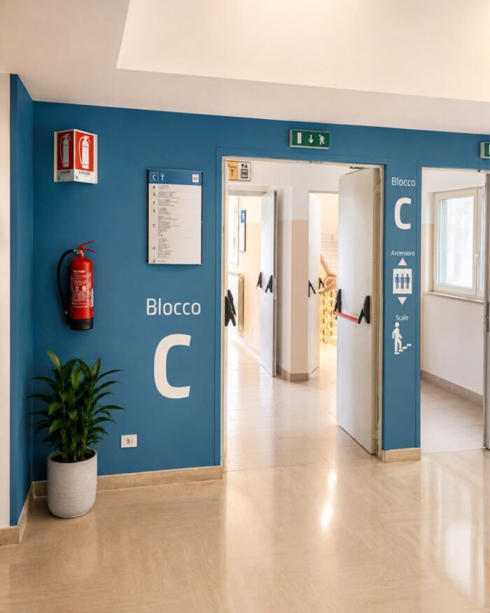
Our work begins here: observing how people actually experience a space before designing any signage.
In hospital, university, or public administration settings, this phase determines the quality of the entire project.
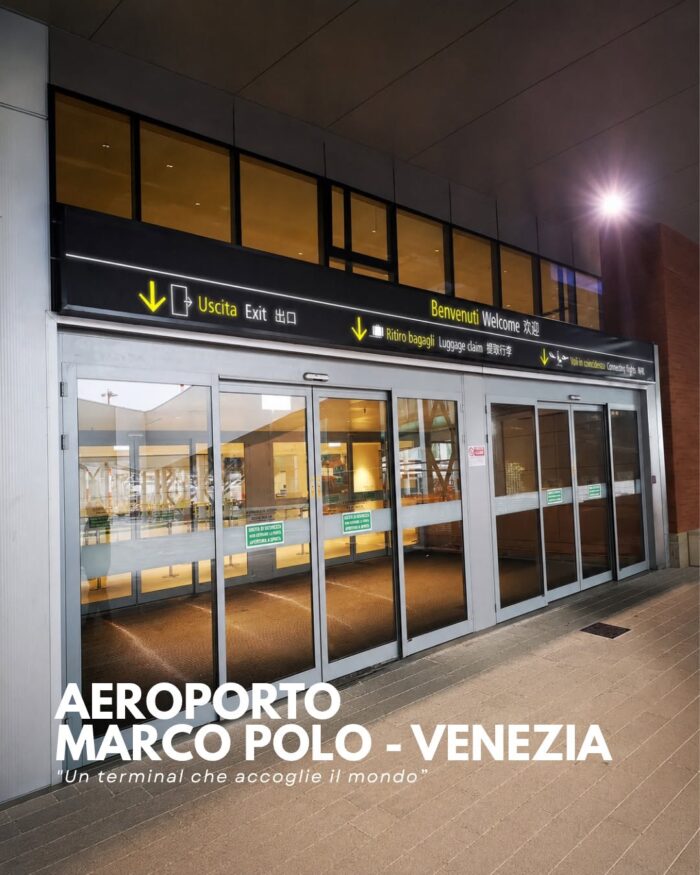
Venice Marco Polo Airport is Italy’s third-largest intercontinental hub, a crossroads of cultures serving millions of passengers each year bound for Europe, the Middle East, Asia, and the Americas.
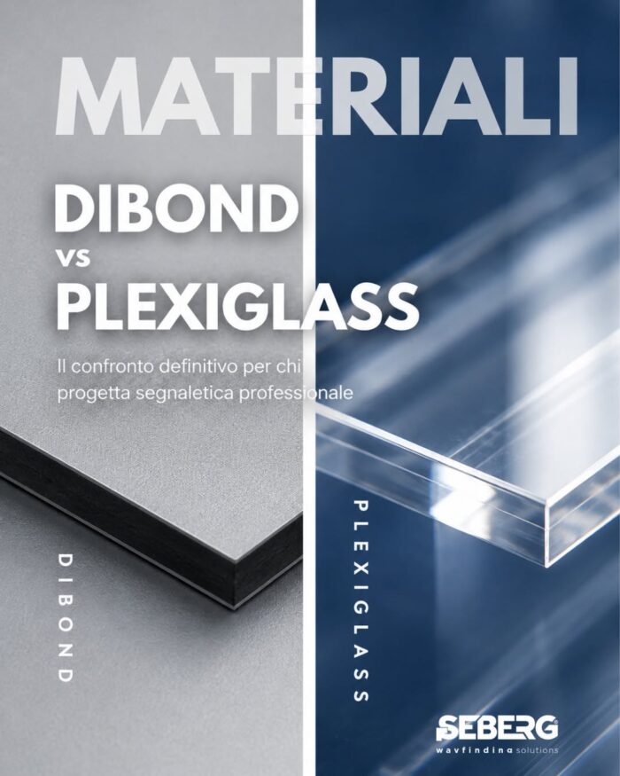
Dibond vs. Plexiglass – the ultimate comparison for professional signage design. When it comes to visual communication, the choice of material is never a secondary matter; it affects readability, durability, maintenance, and the perception of space—and, above all, it shapes how a person interprets an environment as they move through it. Dibond is the ideal choice when a project demands sturdiness, visual stability, and a clean, lasting finish.
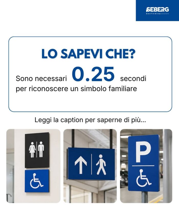
It takes just about 0.25 seconds to recognize a familiar symbol!
Less than the blink of an eye!
And that is exactly what is needed in a complex space—like a hospital, airport, or museum—where no one wants to stop and decipher a sign.
People want to know where to go instinctively.
Pictograms are a universal language that transcends linguistic and cultural barriers.
That is why we design wayfinding systems meant to be recognized and interpreted in milliseconds; it is how a space becomes clear without effort.
If you are designing a place where people need to find their way without hesitation, let’s talk.
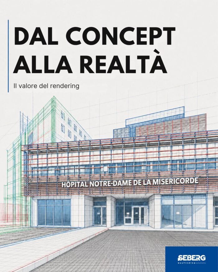
Between the design and the finished product
Rendering is the stage where the PRODUCT enters the real space before physically arriving there.
It allows for the verification and adjustment of aspects that a 2D drawing cannot convey: the perception of distances, color contrast under ambient lighting, balance with the surrounding architecture, and finishing details.
It is the transitional point where the design ceases to be merely an idea on a screen and begins to exist as an object destined for a specific space.
If you are developing a complex project, contact us at info@seberg.it
Designing wayfinding for a healthcare facility is unlike designing for any other setting.People entering a hospital, outpatient clinic, or community health center are often anxious.Here, signage is part of the service itself: it can reduce stress, shorten orientation time, and free up staff from constant requests for directions.In this carousel, we’ve gathered four things that…
