In wayfinding, color is not decoration.
When we design a signage system for a complex structure, the choice of color is one of the first strategic decisions
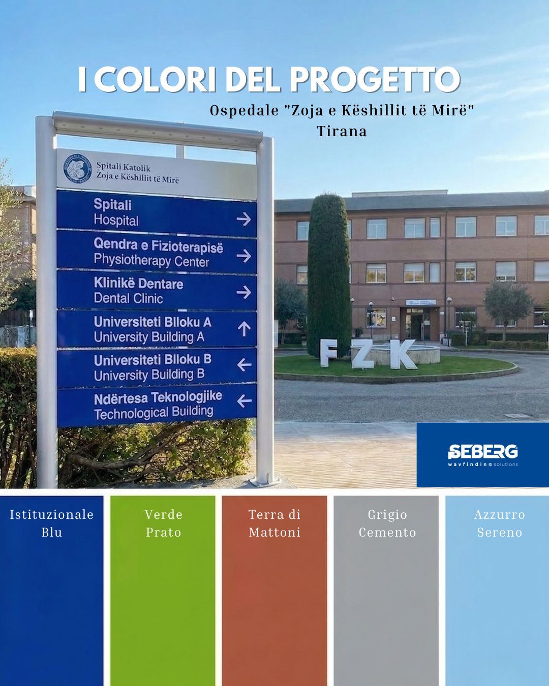
Each color has a specific role: – institutional blue creates hierarchy and recognition – light shades improve readability from a distance and in varying lighting conditions – grays and neutral tones ensure consistency with existing architectural materials.
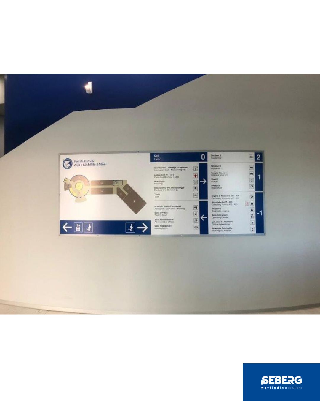
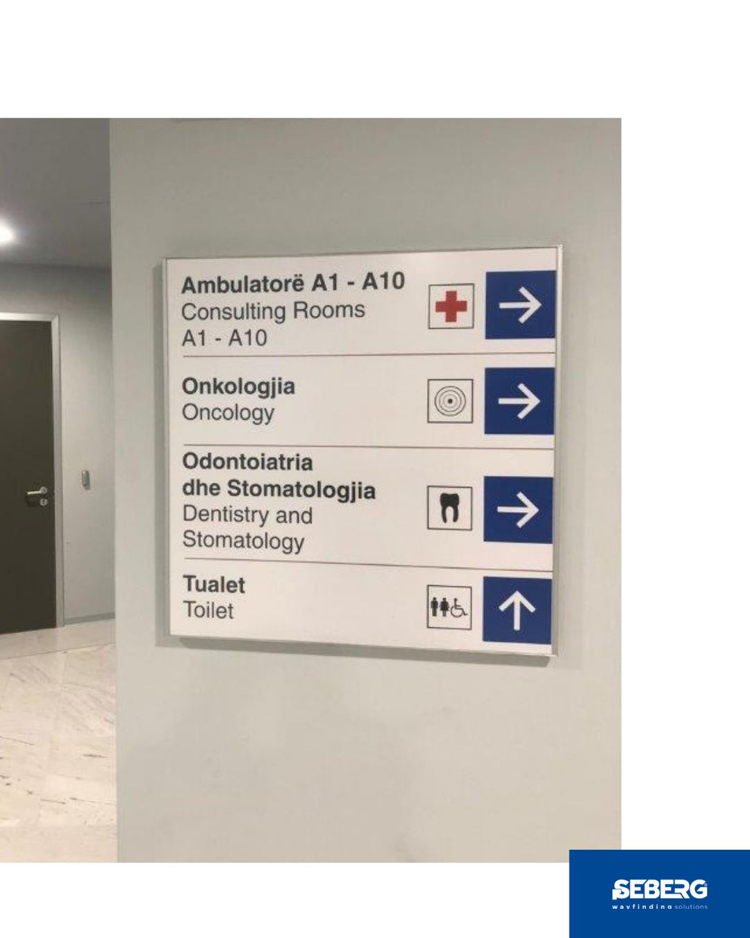
In the project for the Spitali Katolik “Zoja e Këshillit të Mirë” in Tirana, the palette was defined based on the existing architecture, the external lighting conditions and the need to manage multilingual flows (Albanian and English) with maximum clarity.
For design firms and general contractors working on healthcare facilities or campuses: consistency between wayfinding and architecture is not a detail.
If you are developing a complex project, let’s talk about it