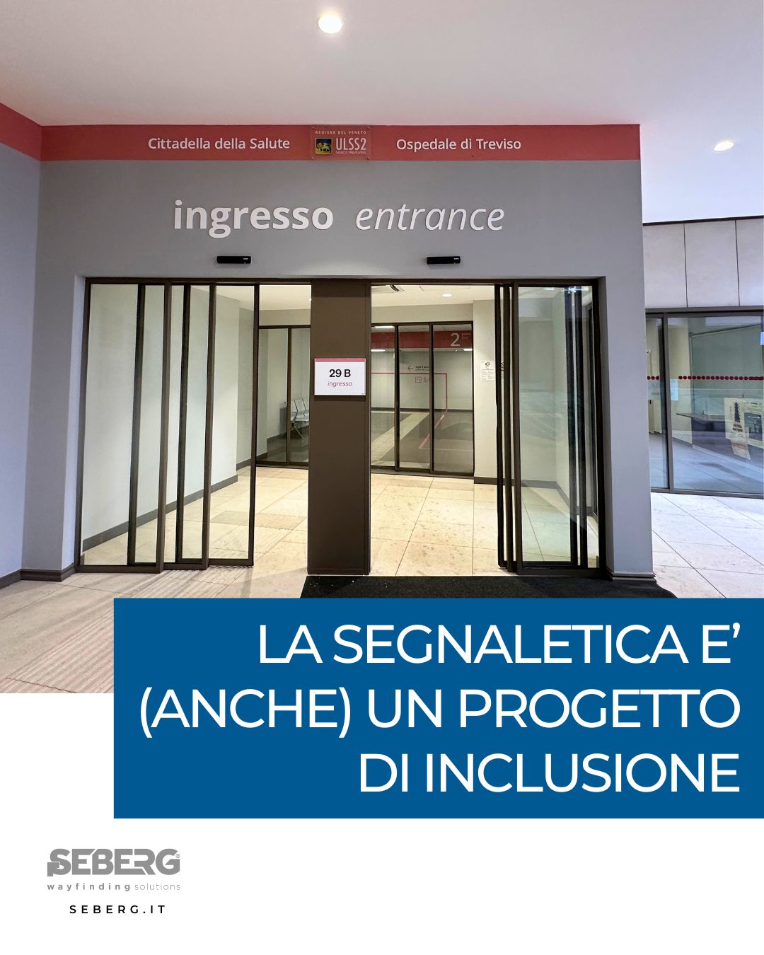
Colors and letters are not chosen at random.
Behind each visual code there is a careful study to make the space clear, readable and accessible to all.
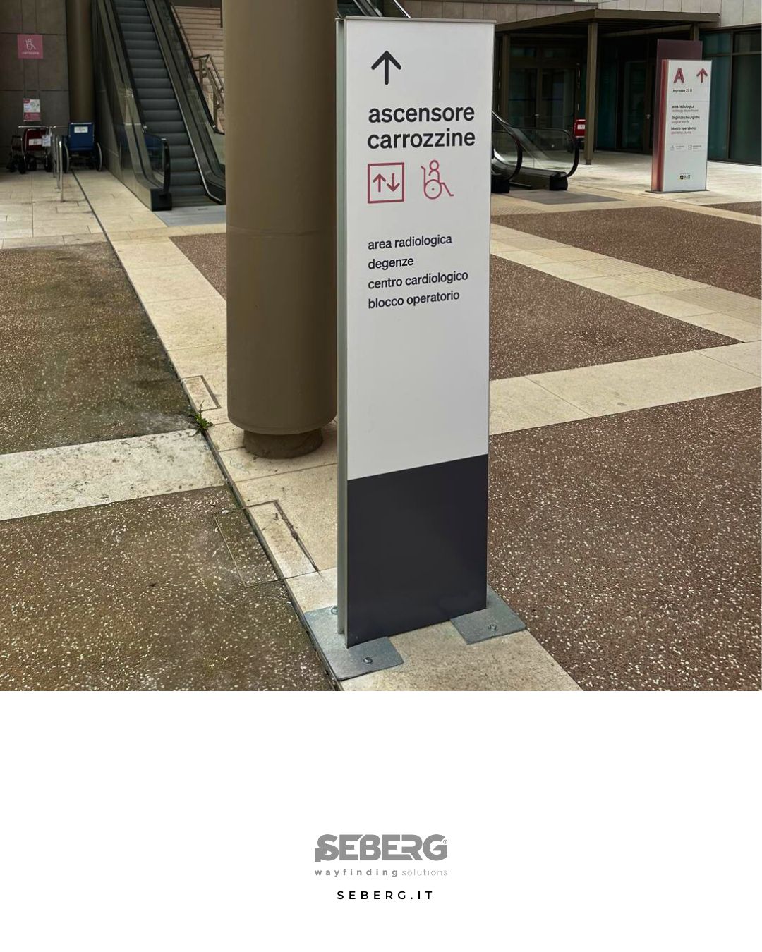
Cittadella della Salute – Treviso – A project by Seberg, designed to clearly guide each person.
Each level is identified by a color and a unique letter: a double coding that also helps those who have difficulty with color perception or alphabetic memorization.
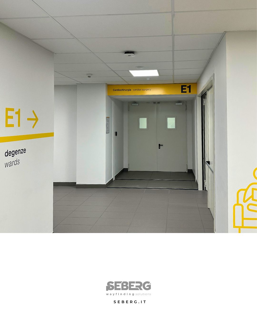
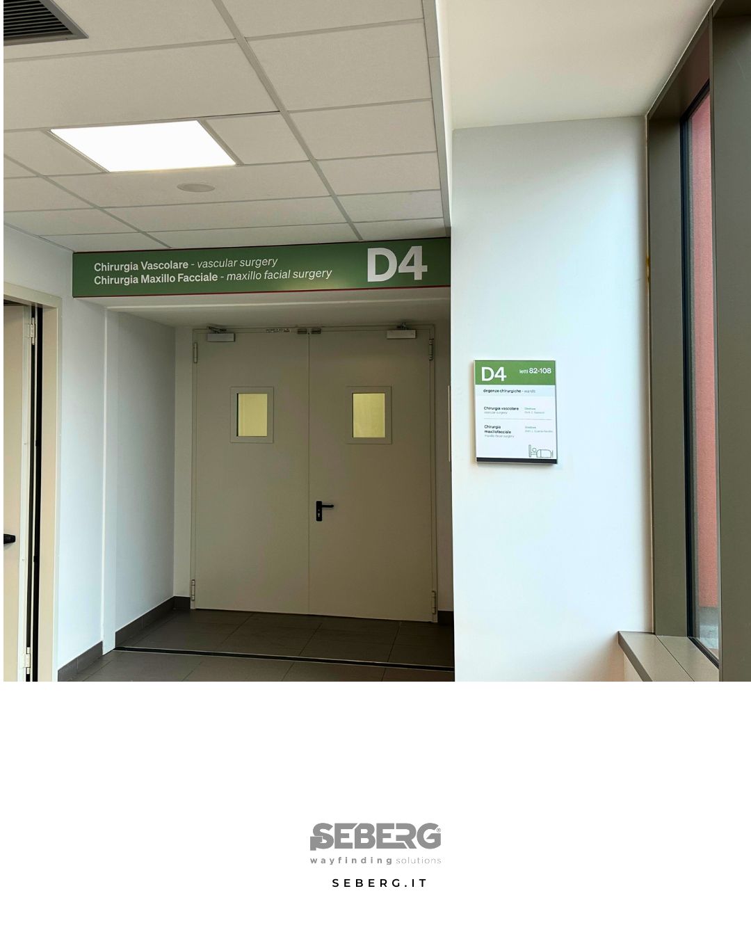
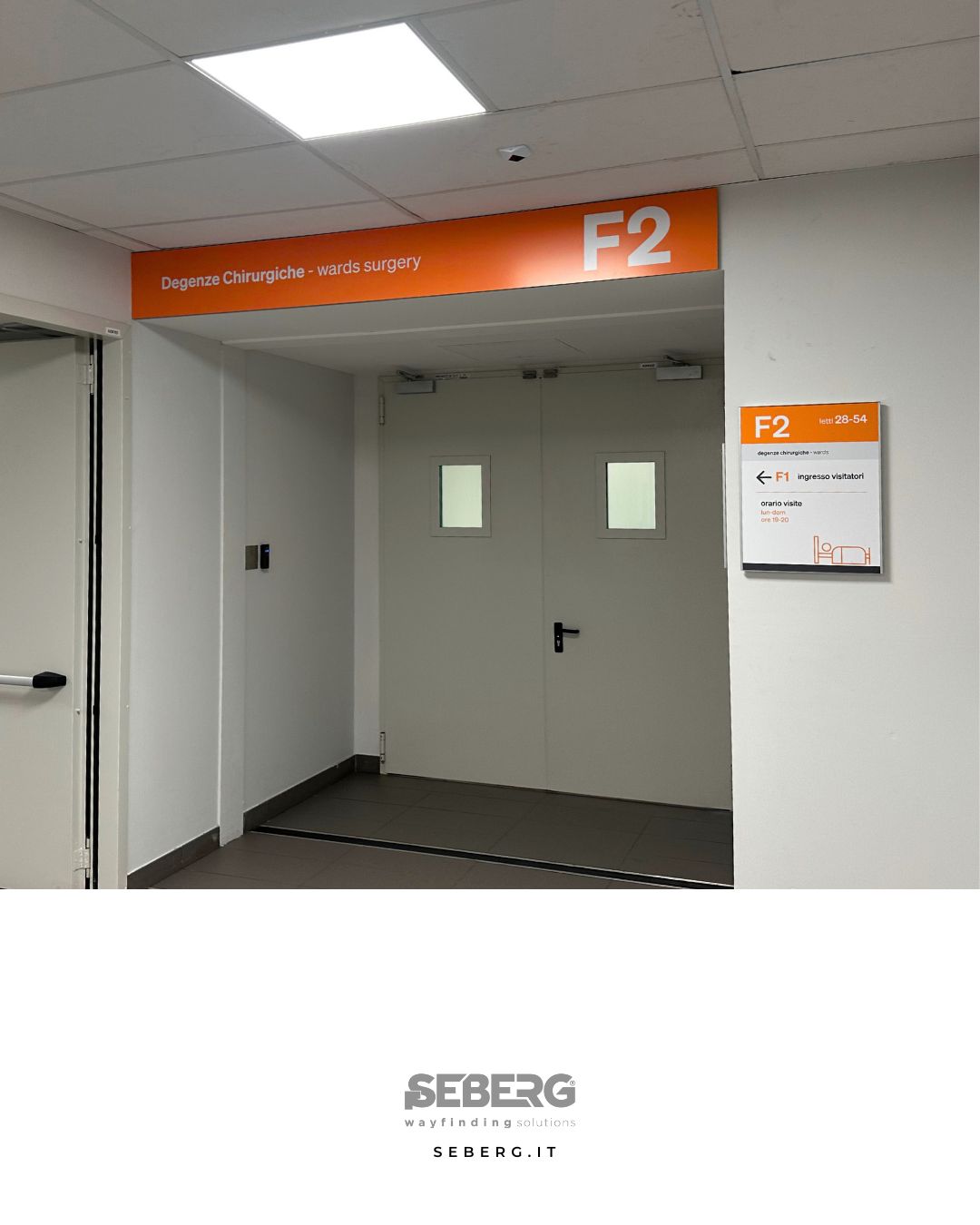
Here are the solutions adopted:
• Wall stickers for permanent indications
• Elix plates with graphics on paper, for simple and fast updates
• Segno Light over-door panels, for department identification
• Suspended signs with Aqua clamps, ideal for long corridors
• External totems model S, for clear orientation right from the entrance
Each element is designed to simplify the journey, reduce uncertainty and make the experience of the healthcare space more human.
Want to improve signage in your environment? Let’s talk about it +39 035 46 12 00