Fonts and Readability: How We Communicate Visual Clarity
When a sign works, it’s not just because it’s “easy to read.”
It’s because it manages to guide the gaze and convey confidence.
At SEBERG, every typographic choice comes from a simple question:
Who needs to understand, and how quickly?
Because a wrong font, in a complex place, is not just an aesthetic detail.
It is an obstacle to the use of spaces.
A font that’s too thin? Invisible from afar.
All caps? Sometimes slows reading.
Readability is a form of respect: for the user, for the space, for the message.
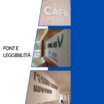
Pictured: three examples of lettering designed to be understood at a glance, in different contexts—from retail to healthcare.
What do you think is the most effective font for public signage?
Tell us about it in the comments or send an email to info@seberg.it for more information.

