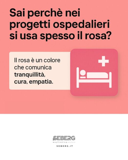
Do you know why pink is often used in hospital projects?
It’s not (just) an aesthetic choice.
Pink is a color that communicates tranquility, care, empathy. It has been identified as the ideal shade to represent spaces dedicated to health, especially in hospital and outpatient settings.
In many cases it is the result of studies on visual perception: it helps reduce stress, transmits serenity and is easily readable even by those with visual difficulties.
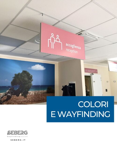
In our experience at the Policlinico di Bari, we applied pink following the regional guidelines, flanking it with pictograms designed specifically for immediate understanding of the information.
Every color, every shape, every choice in wayfinding has a precise objective: to accompany, reassure, orient.
Progettiamo percorsi che parlano la lingua delle persone.
Anche con i colori.