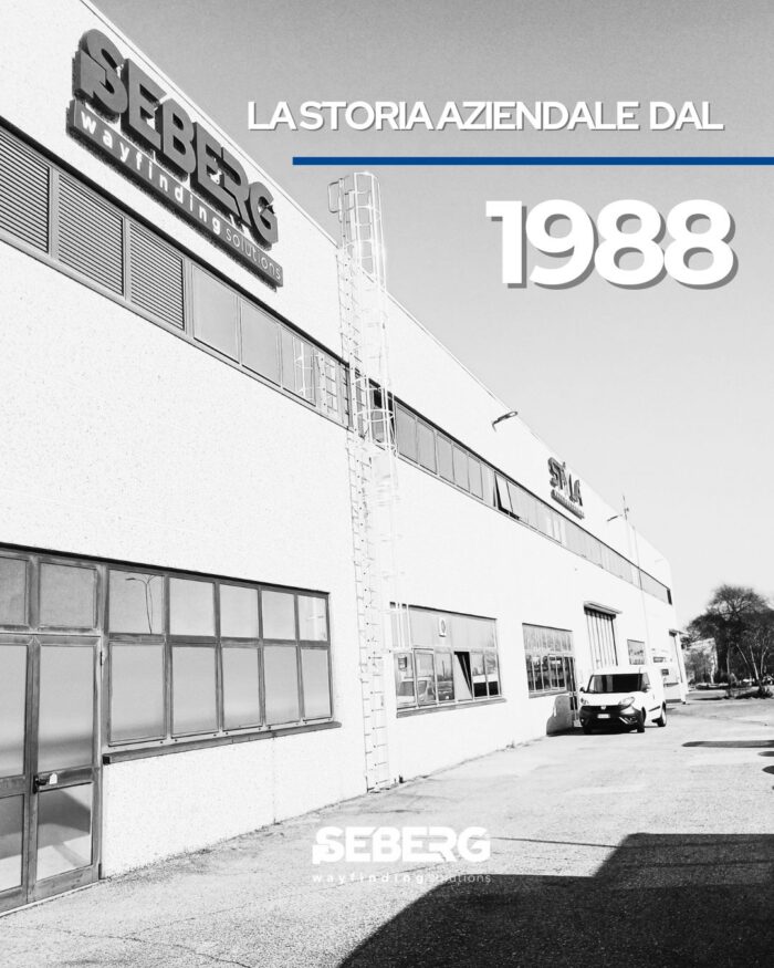
Company history since 1988

When Aldo Pozzi opened the doors of Seberg in 1988, he had a clear vision: to transform signage from a simple indicator into a strategic lever for the experience of spaces. Since then, we have guided people and brands through clear, aesthetically coherent paths that are fully integrated into the architecture.

Signage experiences

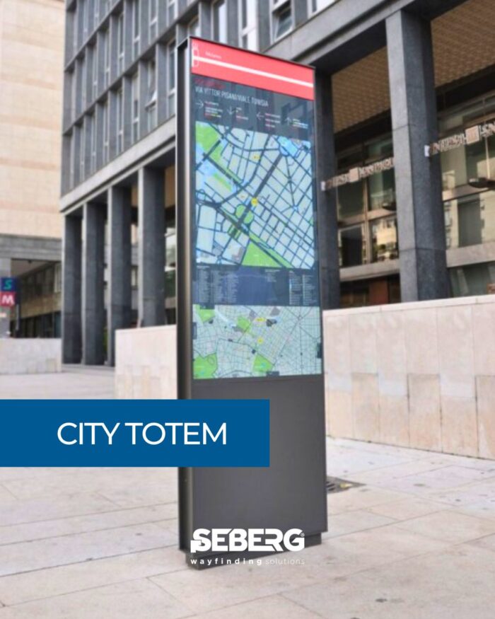
Public administrations, design studios, and urban retail operators ask us for wayfinding solutions that go beyond simple information panels: they want experiences. That’s where our City Totems come into play.

Uncompromising robustness
Galvanized steel structure, 3 mm thick, with anti-graffiti coating
Certified resistance to impacts, UV rays, and temperature fluctuations from –40 °C to +50 °C

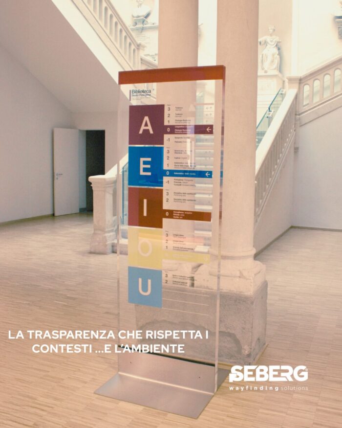
Glass, polycarbonate, plexiglass: transparency that respects the environment

Materials that combine premium aesthetics and long durability:
This is the promise we keep every time we design wayfinding and interior branding solutions for complex facilities – from airport hubs to university campuses and beyond.

Imagine entering a historic building and being guided by light, almost suspended signage that lets the marble and stucco breathe without hiding anything. That sense of clarity is possible thanks to glass, polycarbonate and plexiglass.

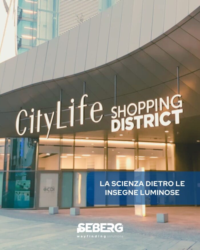
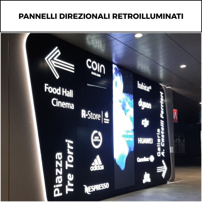
Front-lit or back-lit? The science behind illuminated signs.

CityLife Shopping District is a perfect example: the backlit sign is not just an aesthetic choice, but a strategic intervention to orient, welcome, and enhance the space.

In every architectural or urban project – from shopping centers to stations, airports to public spaces – signage is not just a detail. It is visual identity, guidance, and experience.

But which one to choose?

Totems, plaques, panels, or a mix?

Totems, signs, panels… or a mix? When you really need a custom solution.

Imagine you’re leading a major project: you’ve nailed down every detail, the architecture reflects the brand’s values, and the space is ready to welcome visitors and customers. Yet, something is missing: clear visual communication.

Every space tells a story

The choice between totems, signs, panels, or a combination of both isn’t just a matter of aesthetics. It’s strategic.

Tailored solutions for real needs

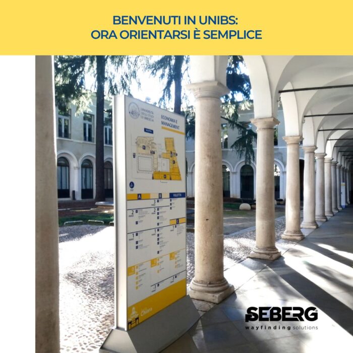
Case study: University of Brescia

At the University of Brescia we have developed a modern wayfinding system that respects and enhances the unique architectural context of a 15th century cloister.
When working with historic buildings, signage cannot limit itself to indicating: it must interact with the environment, enhance it, simplify use without invading the original aesthetics.

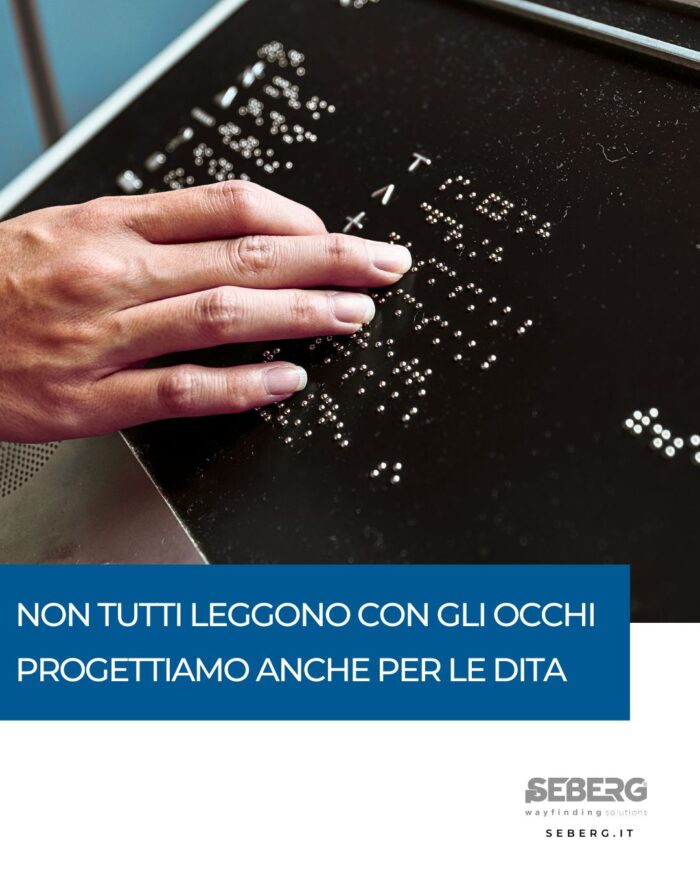
Braille signage for the blind

Never underestimate the power of a raised surface.
Today we’re talking about Braille, one of those silent solutions that make a huge difference for those who need to orient themselves independently.
Designing truly accessible signage isn’t just about adding a pictogram or enlarging a font.
It means putting yourself in the shoes of those who read with their fingers.

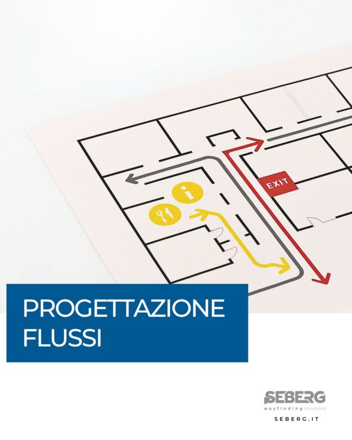
Flow design

Designing flows is (almost) more important than signals.

Yes, because good signage doesn’t start with design… but with the movement of people.

Before even thinking about where to put a license plate, we study how users move, what routes they take, where they slow down, where they hesitate.
That’s where you need guidance. That’s where we come in.